What started as an idea to do a comparison between Tableau and D3, ended with a comparison of Tableau Public, Highcharts (cloud; free), Quadrigram ("free" / trial online version), Plotly (free online version) and a (sad) realization that D3/coding is just not my thing, at least not in my personal situation with a few free hours here and there. This realization has been hard to admit, given how far I have come in under a year, but after spending another three hours just getting the X-axis to draw properly with the data I have, I just gave in to the thoughts that I am more of a drag-and-dropper than a from-scratch-coder. No shame in that, and now I know (again.)
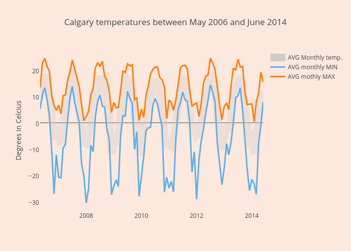
To fairly compare the tools I used the same base data with Calgary temperatures in Celsius between May 2006 and June 2014. The data is from the University of Dayton (http://academic.udayton.edu/kissock/http/Weather/default.htm) who get it from the National Climatic Data Center.
The goal of this comparison was not to do a time consuming in-depth analysis of the tools, but rather to get an impression what can be done with these tool let say based on intuition and perhaps looking at a few tutorials at most. I have heard about these tools many times and wanted to see if they would provide me a way of fairly easy data visualization with enough control and options but nothing too complicated and time consuming for a tech-minded person with tool/software experience. I am sure with further learning and practise more options are available than demonstrated below, and some conclusions may prove to be wrong. However my personal experience with new tools is that I tend to “play around” before deciding to invest more of my time, and the findings below are to be seen as findings after this playing around. I hope it provides other potential users with some ideas on which tools may work for them.
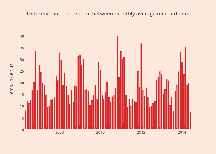
I started with Tableau (since I use that at work and am familiar with) to create a basic graph combination that I wanted to duplicate as close as possible with the other tools. I also used Tableau for calculating fields like monthly average, monthly average minimum and and monthly average maximum temperatures, as well as the difference between the min and max, and then exported this data extract (including calculated fields) to be used in the other tools to Google Drive. This directly showed a strong aspect of Tableau: manipulation of the "raw" data, where all the other tools pretty much need a clean and specifically prepared-for-the-task-at-hand data (sub)set. Polly does provide data tools but after trying them for 20 minutes or so I did not find them to be very intuitive. Quadrigram provides Formulas to create calculated fields but I didn’t use that since I already brought that in from Tableau. Highcharts provided no options to manipulate the data. Highcharts did read the date-data well, where Quadrigram and Plotly did not like my mm/dd/yyyy data, to the extend I had to create month-year categories.
Highcharts and Plotly were easy to work with to create a combined graph, consisting of vertical bars and a line. This I found impossible to do with Quadrigram. The colouring of the bars and lines was consistently limited to one colour per dataset or range. I would have liked to use colour scales to indicate higher temperature differences with darker red and lower differences with more yellow, but only Quadrigram (in addition to Tableau) allowed for that as far as I could find.
The layout was where Quadrigram stood out to me, again with Tableau. It allows the dragging an dropping of page elements aligned to a pre-defined and output based grid which worked great. This includes the selection of items in one graph being highlighted in another although I must admit I could not yet get this to work properly. With Plotly and Highcharts you basically create single graphs and place / embed them individually to put them in the right position on your page. Talking about embedding: this is the part I am not fond of with Tableau Public, as the embedded component always appears to be slow and acting strangely, sometimes opening in new pages and usually going to the the Tableau Public Server / environment. Don’t get me wrong, I get that. It’s an expensive and very strong and complete tool that is offered for free, so there must be some caveats. One of them being unable to embed them in typical blogging environments. But the other tools are also not much better, likely for the same reason: being offered for free so the companies want something in return. In my quick assembly I found Plotly the one that adjusted most easily to page adjustments etc. but I should note that Quadrigram allows you to download the whole “creation” (source code) as a zip file. I tried that and the content didn’t mean too much to me, but it may be more useable for someone with a stronger web developing background. By the way, this was also the first time Quadrigram actually mentioned I am on a timed trial, although through email I was told this automatically extends.
In general I liked all tools I tried and appreciate the progress all of them have made in the last year or so, as well s the fact that they are all offered for free. Some restrict functionality but I think that is totally fair (using the free account). As I work with Tableau at work, it allows me to work with the data and provides the most flexibility and functionality, I will stick with that for personal projects as well. But I will definitely keep a close eye on all these three other tools (as well as others), where Quadrigram stands out for it’s ease of use in the layout department in this comparison, and Plotly for the ability to quickly generate something useful and usable.
PS: although I embedded the plotly graph last week that Embed option appears to be gone, and only a sharable link can be generated. I am assuming that I am missing something, or that it is being updated (it is the middle of the night after all) but if embedding were to be removed it would seriously impict the usefulness.
Any comments or questions? Fire me a message on twitter: @rjweise

The graph below is based on the same date but using https://cloud.highcharts.com. Very quick to create, but with the free out-of-the-box options (without logging in) the possibilities are limited as one would expect.