
As I wrote in my previous post, I decided to switch from blogging through Tumblr to creating webpages from scratch using Neocities. One problem with that is how to ensure people can read the posts that I wrote in the past, now that the platforms are going to differ. While realizing that my readership is minimal, I still don't want to discourage the few readers readers by providing clumsy navigation to the posts. And I was also looking to do something different with D3. Voila, the blog post link graph!
This post will go through a bit of the design process that went into creating the final result. Although it still contain many opportunities for improvement, I am happy that it is working as I had hoped originally. The legend solution was a bit different - and far more manual - than I anticipated (and I know there is an easier and better way, I just haven't figured it out yet) and I still struggle with the whole CSS layout challenge, but it looks half decent imho.
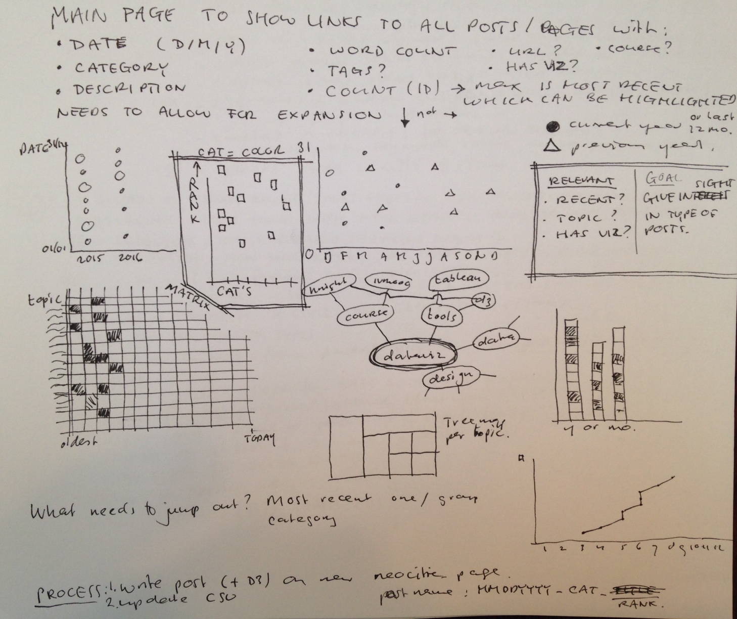
My main goal was to provide an overview of my blogposts - currently hosted on three platforms -, and allow readers to open the blogpost they wanted to read directly from the graph. They would have to be coloured by one attribute and positioned by two others. After some idea sketching (see on the right) I figured the colour would be based on the main category of the blog post so searchers could easily find posts related to a main topic. Since my intend is to keep these main categories limited to 6 or 7 it would meet my encoding needs.
The next question was how to visualiaze the actual data and based on what attributes. I figured the relevant information about my blogposts (other than main category/topic) would be how recent the post was, and what it was about on a more specific level (through tags). It would also be nice to show if the post has a visualization included, but that ended on the wishlist for now.
I also wanted to keep in mind that although a graph may work well with the current dataset, as this dataset grows in the future the graph should still work. This made me lean initially to put the categories as "columns" on the x-axis, so that adding squares would just make the graph longer. Nice idea in concept, but it just didn't seem to work well. Turning it 90 degrees worked a lot better but it had to work for adding many more post squares to be added to the right of the graph. The current solution is that for older posts the reader needs to scroll the graph to the right. And where I initially thought this was not an appropriate solution, I realized that most readers would only search for recent posts (all showing in the initial graph rendering) and only some would want to search for perhaps "d3" posts which would then require scrolling. To me that sounded acceptable, especially thinking that at some point I would add some buttons to highlight posts of a specific category and / or tags.
The final result - see below - was a dot-graph (with squares) showing on the x-axis how recent the post is (the more recent, the further on the left), the different tags on the y-axis, and the colour of the square indicates the category. Hovering over the squares shows the post title, providing some more description of the post. As mentioned it can use some clean up and additional functionality to work better, but I am hoping I will learn that in the next 12 weeks going through "D3.js in action" by Elijah Meeks. Just having started reading chapter one, it looks promising.